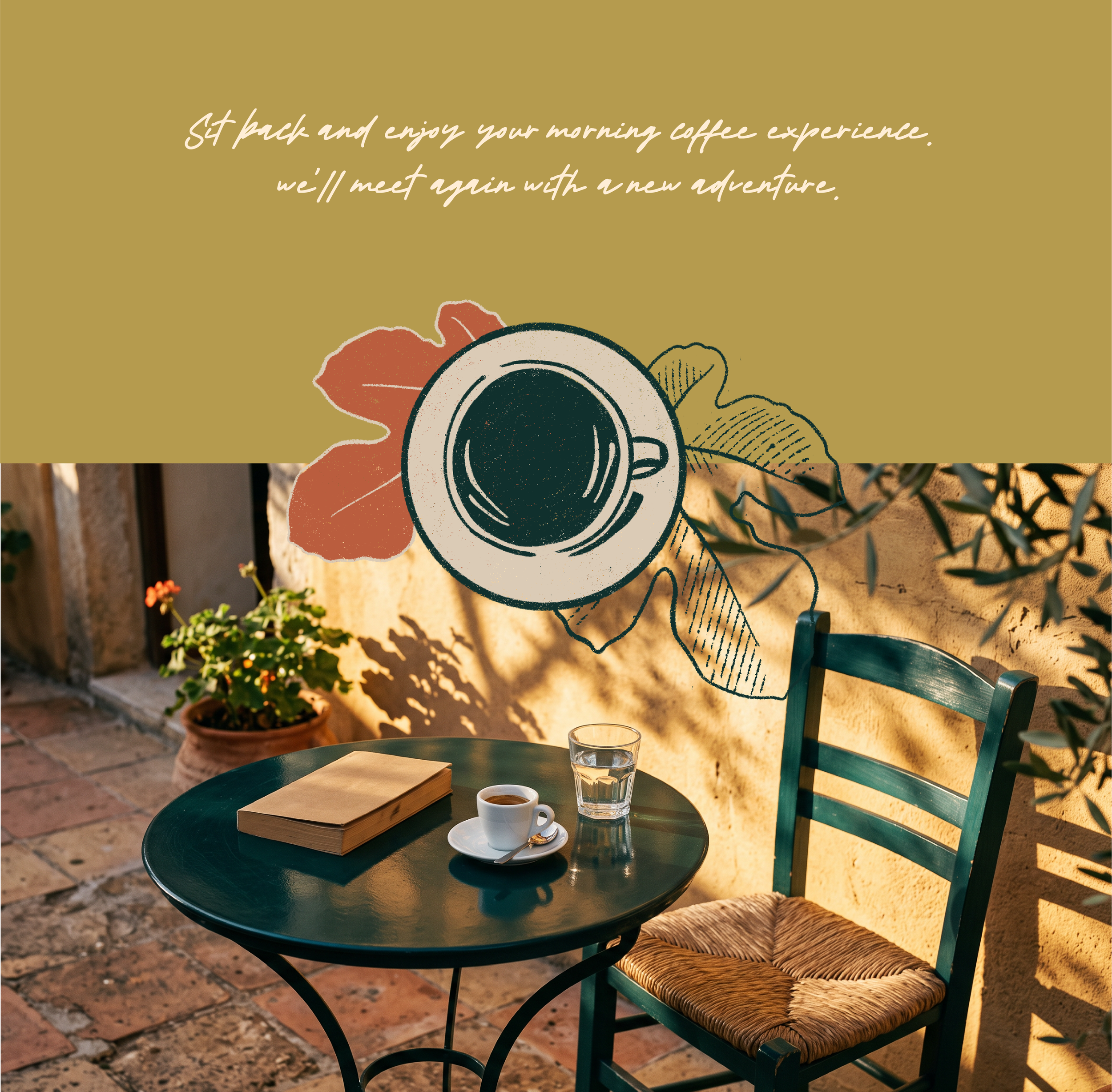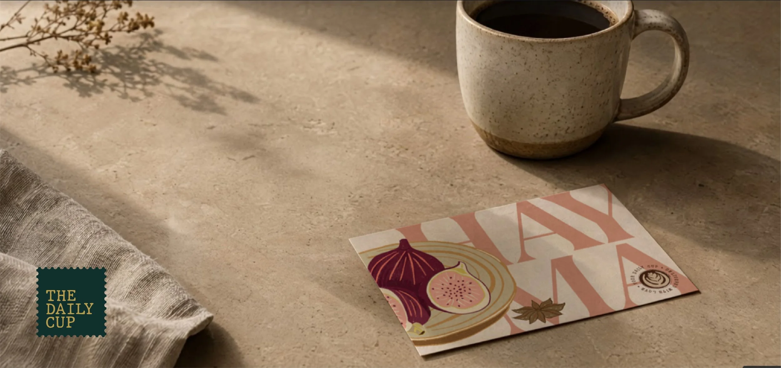
THE DAILY CUP
The Daily Cup is a coffee subscription for people who love good coffee but don't want to spend their mornings figuring out ratios & temperatures. It's for the curious drinker — someone who wants the depth of specialty coffee without the homework.
Most subscription boxes overlook this person. The Daily Cup was designed for them. A box that arrives each month like a package from a well-travelled friend. Inside, they find a new coffee to explore, a few printed pieces worth keeping, and permission to simply enjoy the cup.
This case study is about how print and packaging can turn a monthly delivery into a mini adventure in someone's kitchen.
CATEGORY
Coffee Subscription
Concept Print & Branding
AUDIENCE
The curious drinker who loves good coffee without the homework. Drawn to origin stories, well-made objects, and small moments worth slowing down for.
SCOPE OF WORK
Brand strategy · visual identity · packaging system · print collateral
THE THINKING & STRATEGY
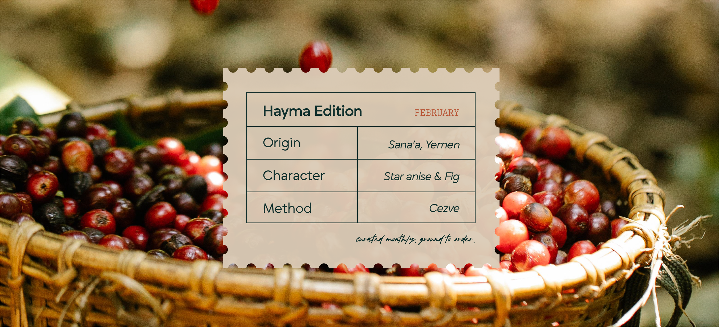
Before I started designing the brand collateral, I made some decisions that shaped every touchpoint. Each one also consciously ruled something out.
if a piece felt personal and worth putting up on their fridge door, it belonged in the box.
Curation over education
I wanted The Daily Cup to introduce coffee the way a friend would. No brewing lectures, no tasting note wheels, no homework. Just enough context to make the cup interesting.
A letter from a well-travelled friend
This metaphor set the voice and the design language. It’s meant to sound personal and warm - like a handwritten note. I didn’t want it to read like a spec sheet.
Worth keeping
Every printed piece had to earn a place in someone's kitchen, not just in the box. Things that mean something to the person keeping them, not ones that exist to show off.
THE CREATIVE EXECUTION
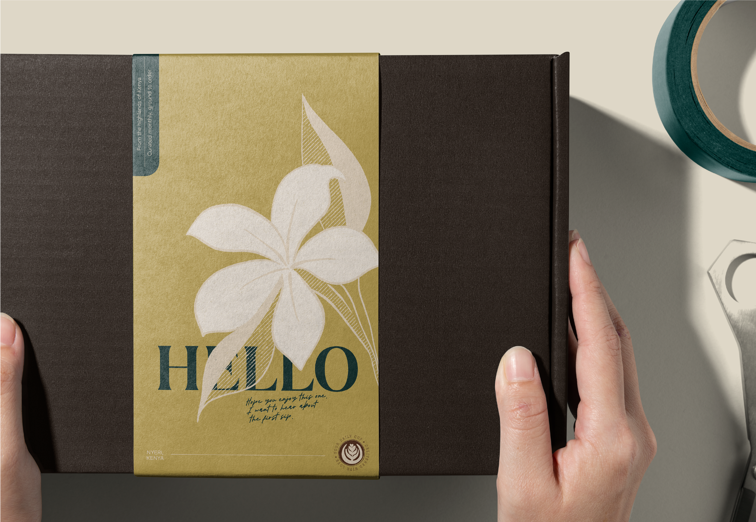
As you unbox, each piece appears in the order you'd meet it: something to open, something to discover, something to do, and something to keep.
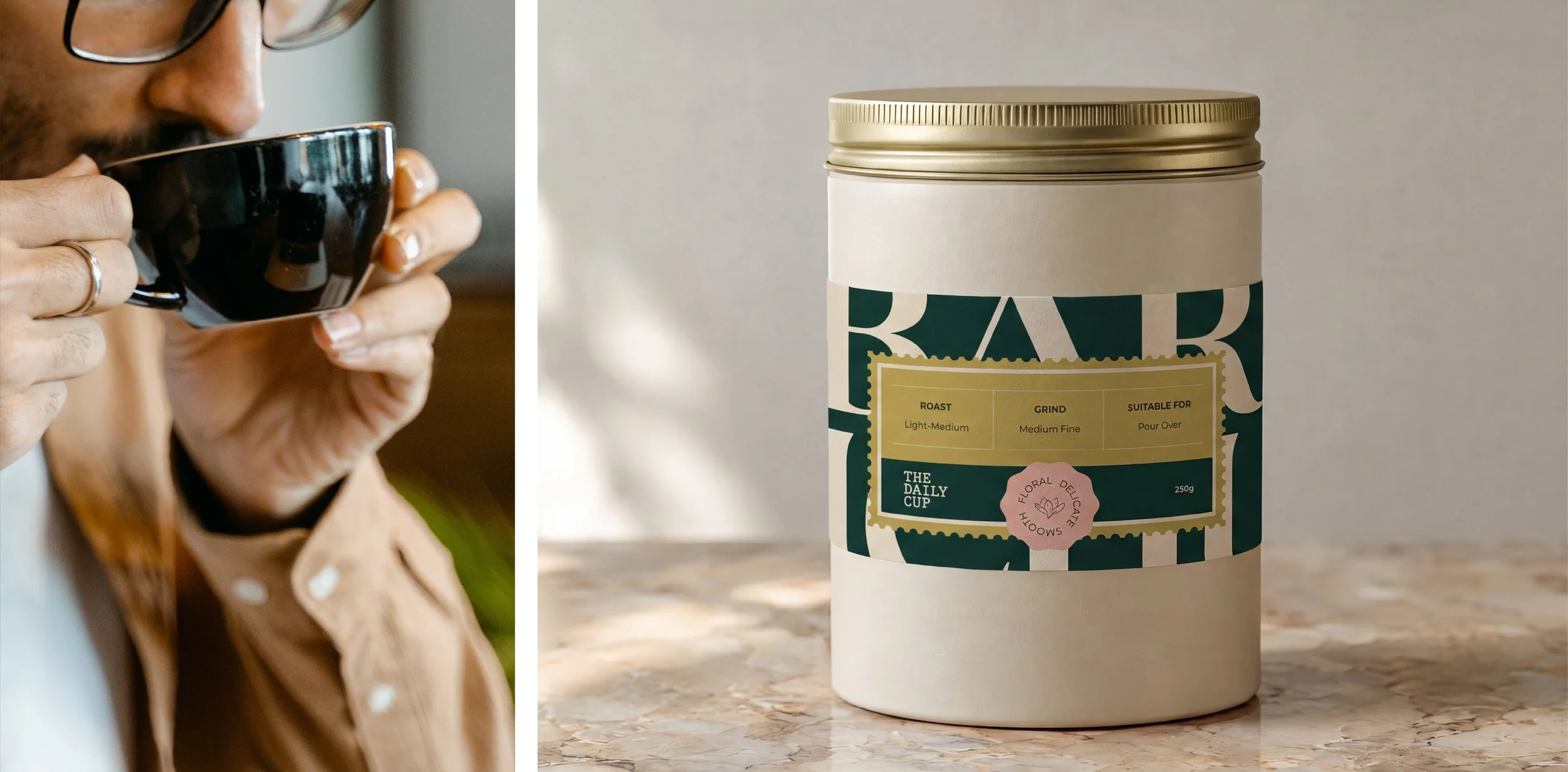
The outside of the box gives away just enough, not the whole story. The point is to make you want to see what's inside.
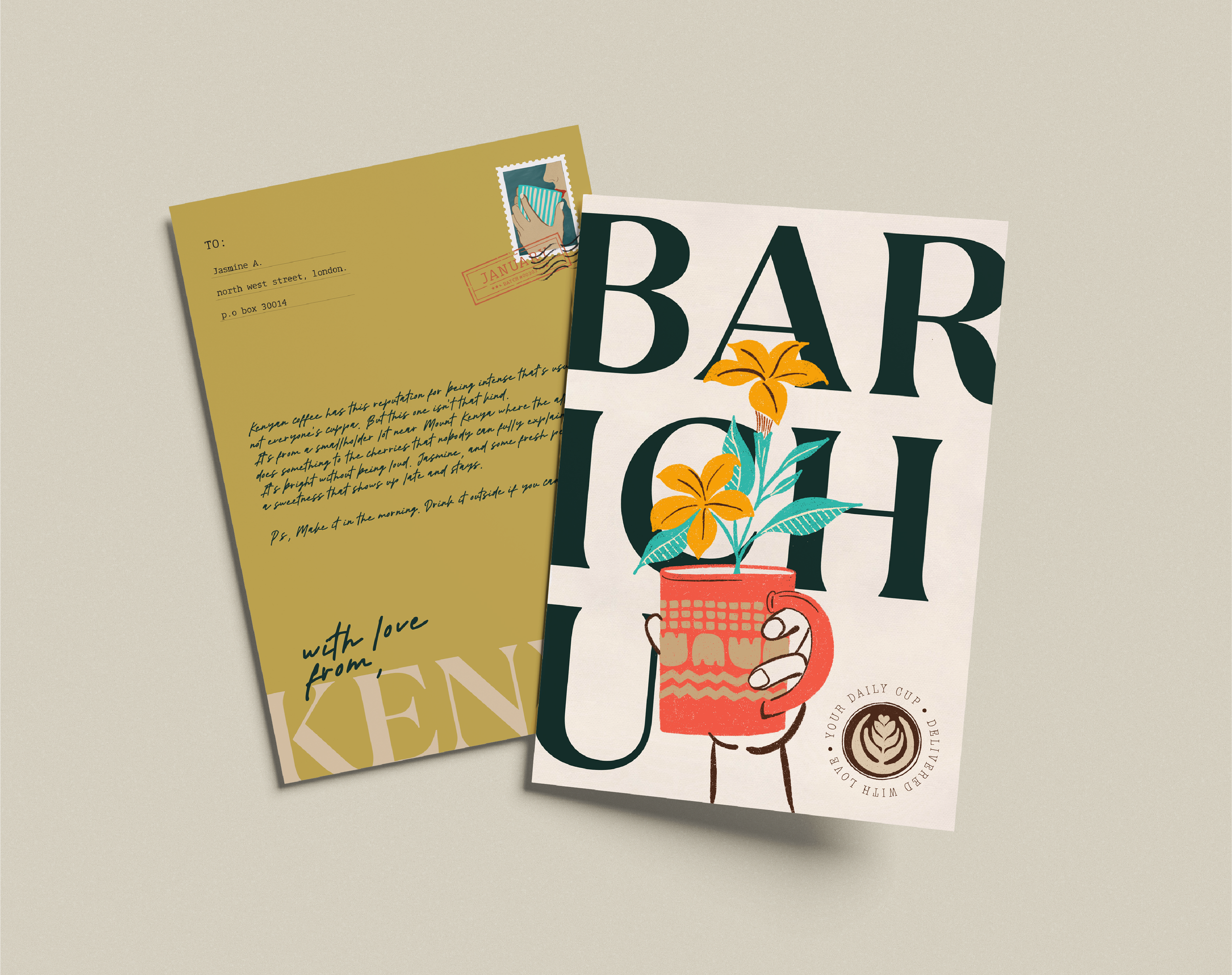
Then you discover the postcard, which is where the box turns personal. The copy is written to make you pause, go "hmm," and smile a little, and each edition's illustration is based on that month's coffee, in a style that feels hand-made for it’s receiver.
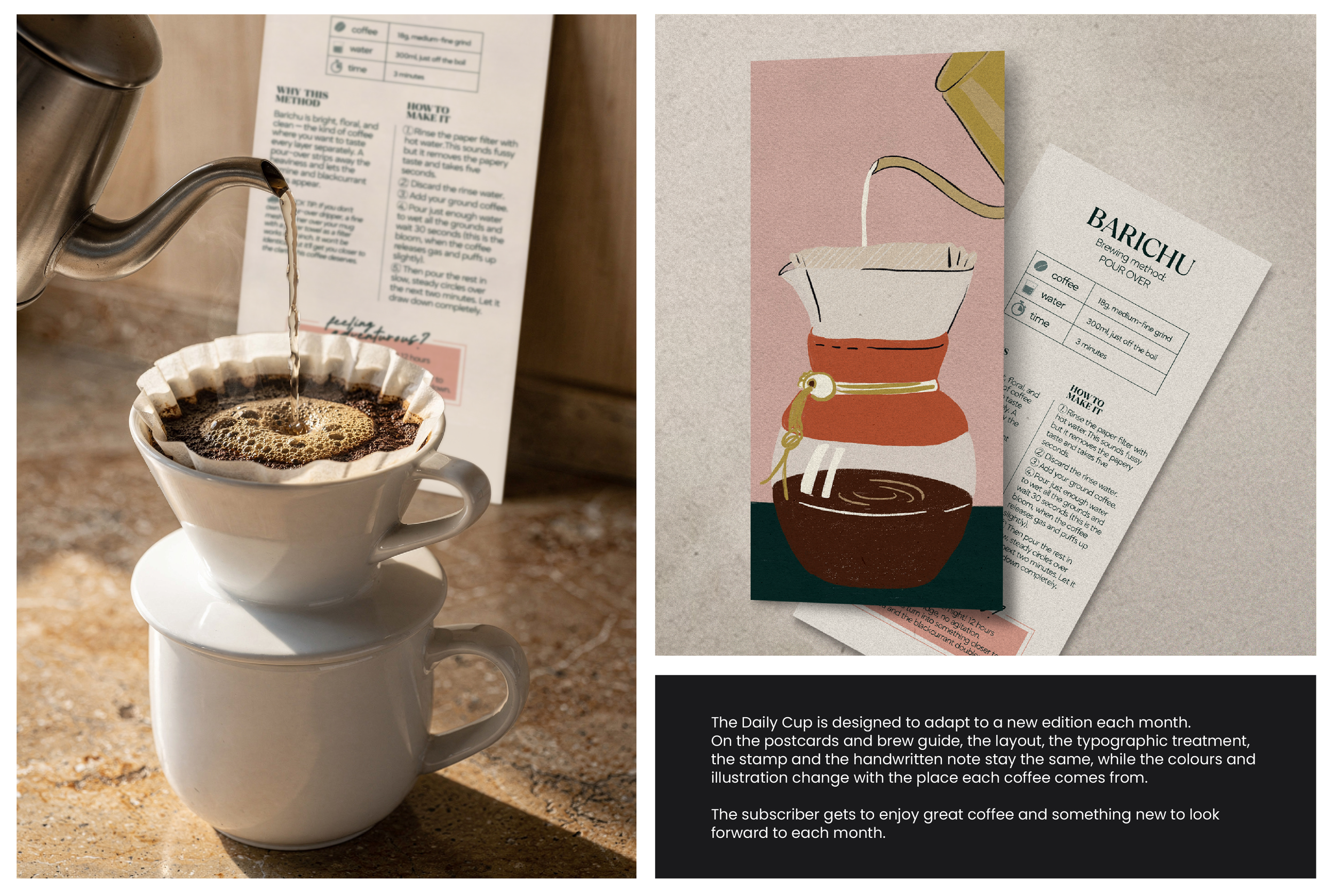
The brew guide gives you something to do.
It offers one method, chosen to bring out that month's coffee, in simple words. It ends with an experiment for the adventurous.
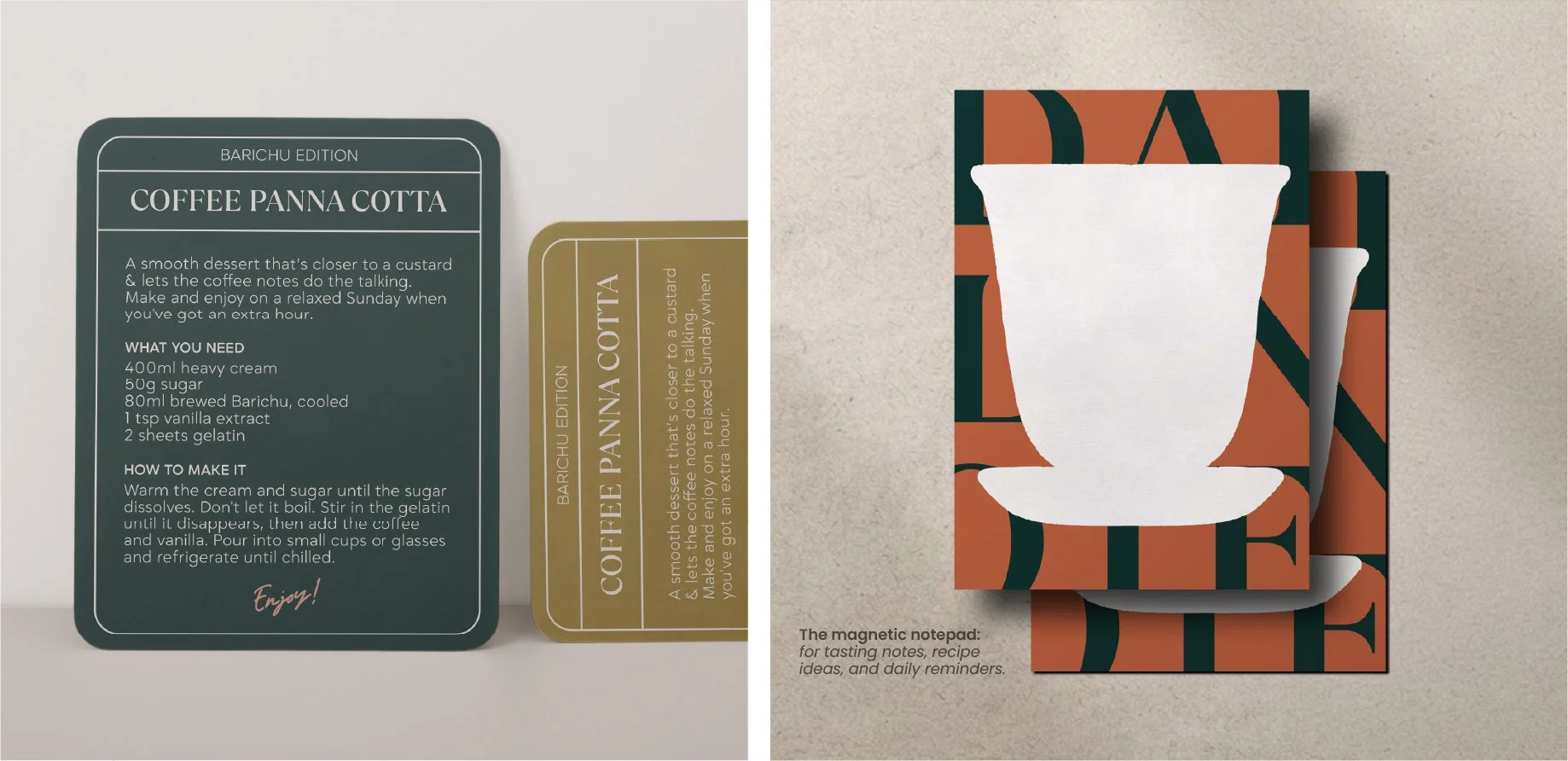
Then the recipe card takes the coffee beyond the cup, with something else to explore.
The last piece is a magnetic notepad. Jot a tasting note, a recipe idea, a reminder. It stays on the fridge after the box is gone. Something to keep.