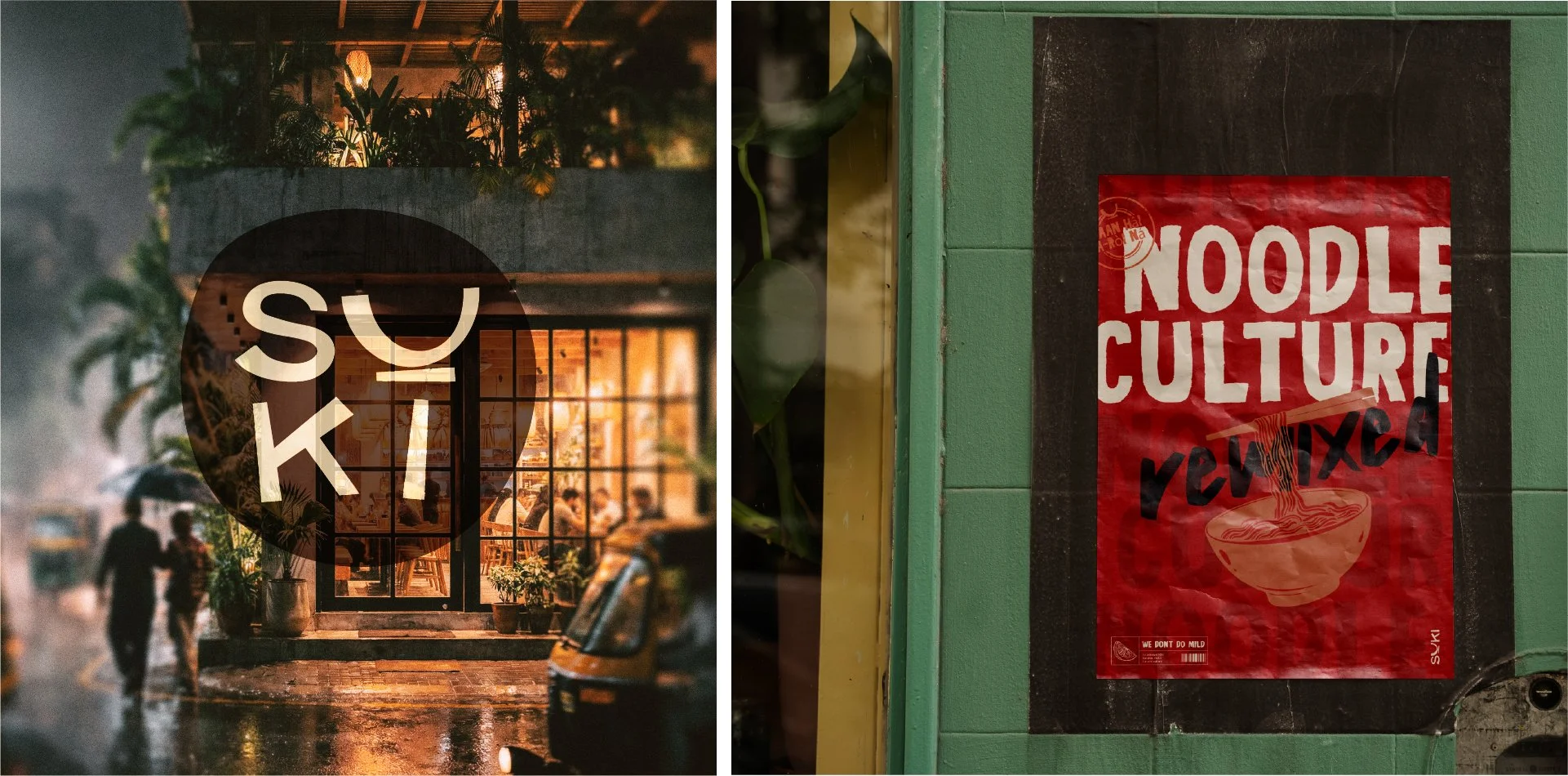
SUKI
SUKI is a fictional modern Thai noodle bar concept brought to life as a passion project. Born from a love of bold street food and vibrant city culture, SUKI reimagines the energy of Bangkok's street food in a refined yet bold space.
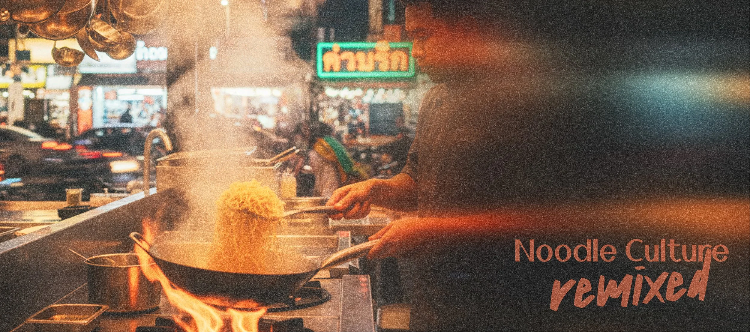
It isn't just a restaurant—it's a curated chaos of flavor, design, and community. Think neon lights, bold murals, and communal tables, all grounded in earthy tones and urban textures.
This case study explores how the brand was shaped, from strategy to visuals.
CATEGORY
Restaurant - Concept Branding
AUDIENCE
Culture-curious, well-travelled urbanites (ages 25–55) with a taste for global flavours and nostalgic experiences.
SCOPE OF WORK
Logo Design · visual identity system · brand collateral · brand messaging

THE GOAL
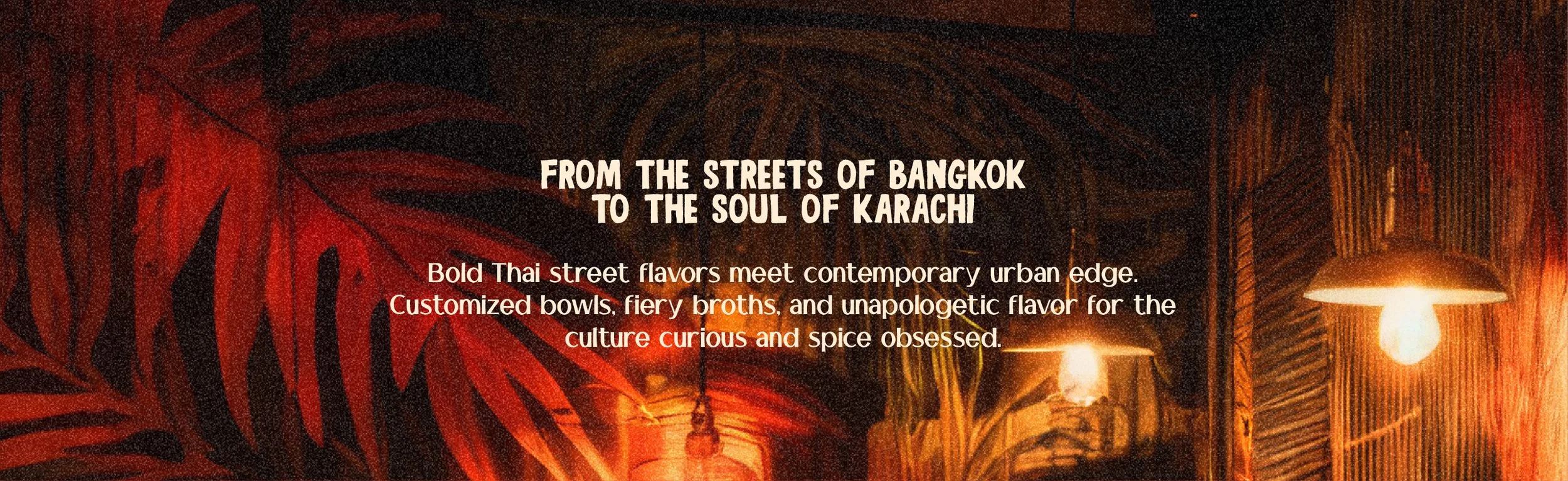
To create an identity that balances street food grit with curated design. SUKI is designed to feel energetic and intriguing.
It has the boldness of Bangkok night markets and the intentionality of a modern brand.
The goal was to create a concept that would feel just as at home in Karachi as it would anywhere else in the world.
STRATEGY
SUKI is positioned as more than a noodle bar. It's a lifestyle space that celebrates connection, community, and culinary culture. The strategy leaned on three key pillars:
Vibrant Flavour: Not just in the food, but in the brand's tone, visuals, and energy.
Street-Chic Design: Mixing street food authenticity with curated, urban aesthetics.
Community-Centric Vibe: Designed for solo diners, friend groups, and the flavour-curious.
EXECUTION
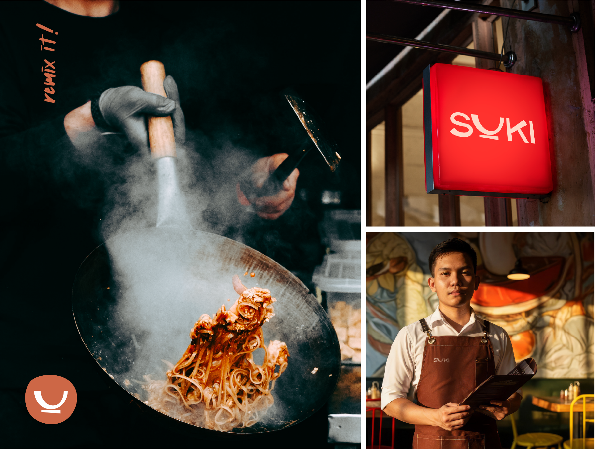
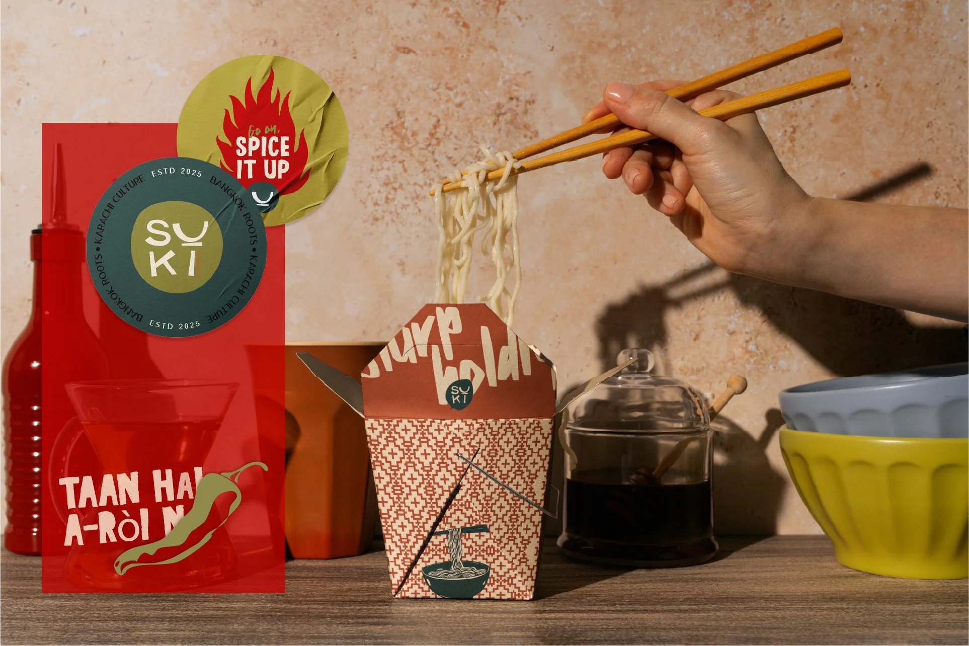
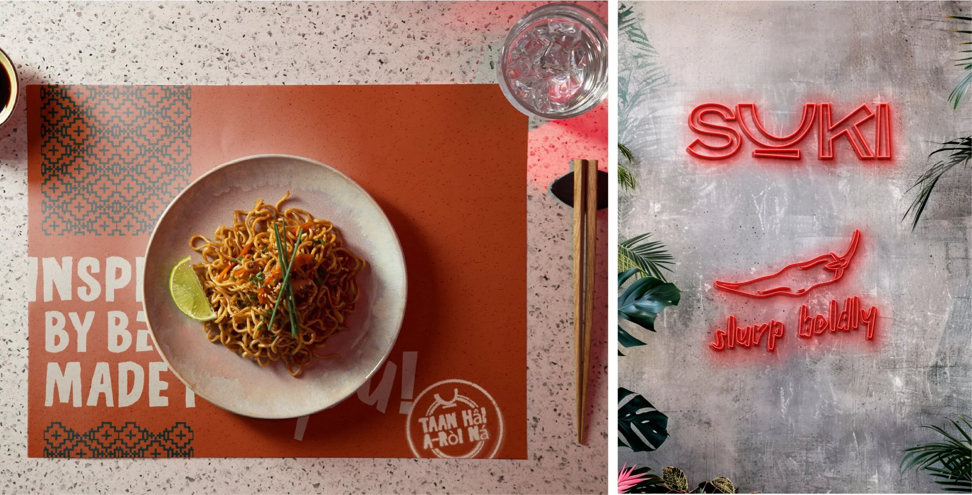
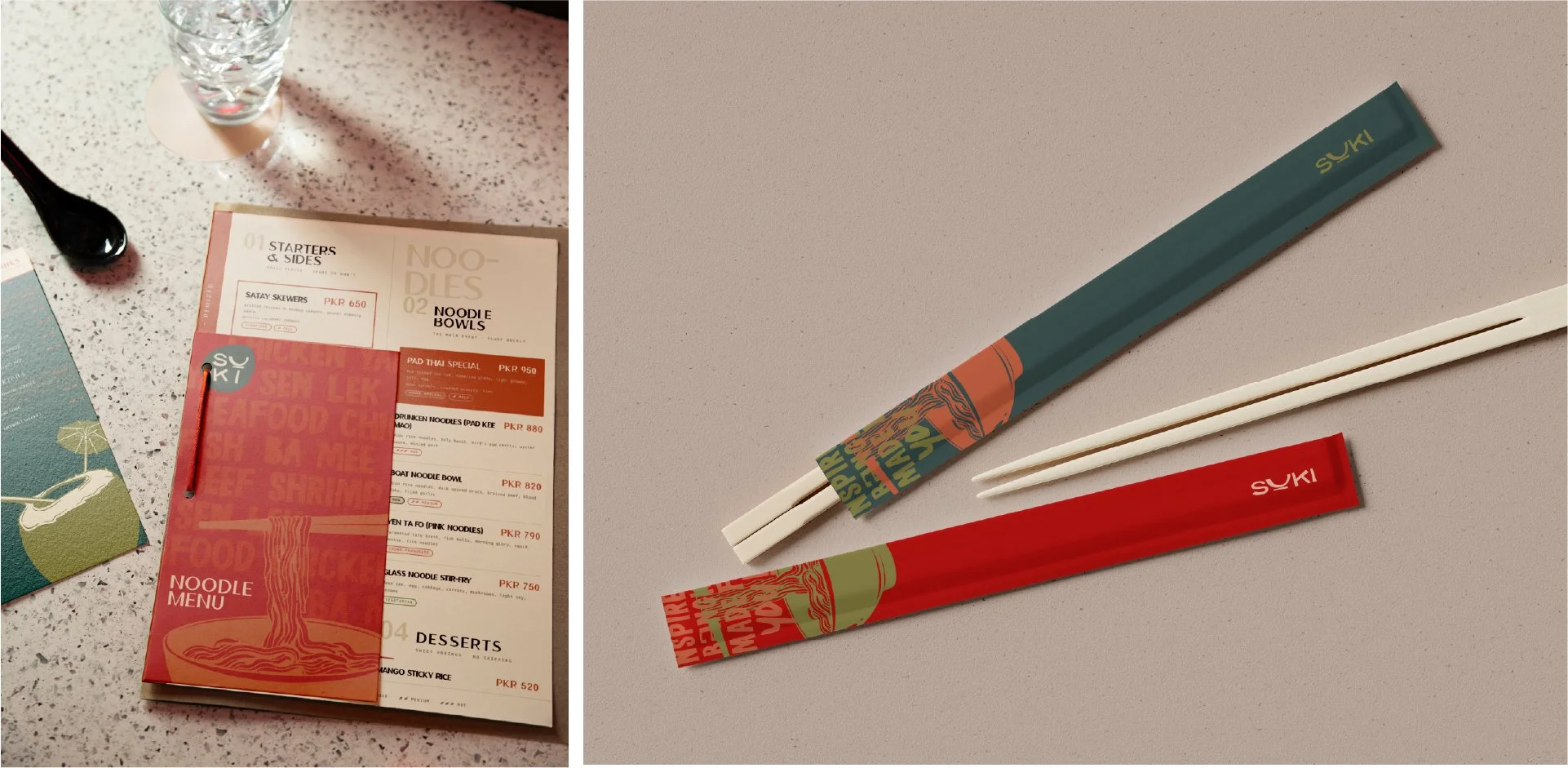
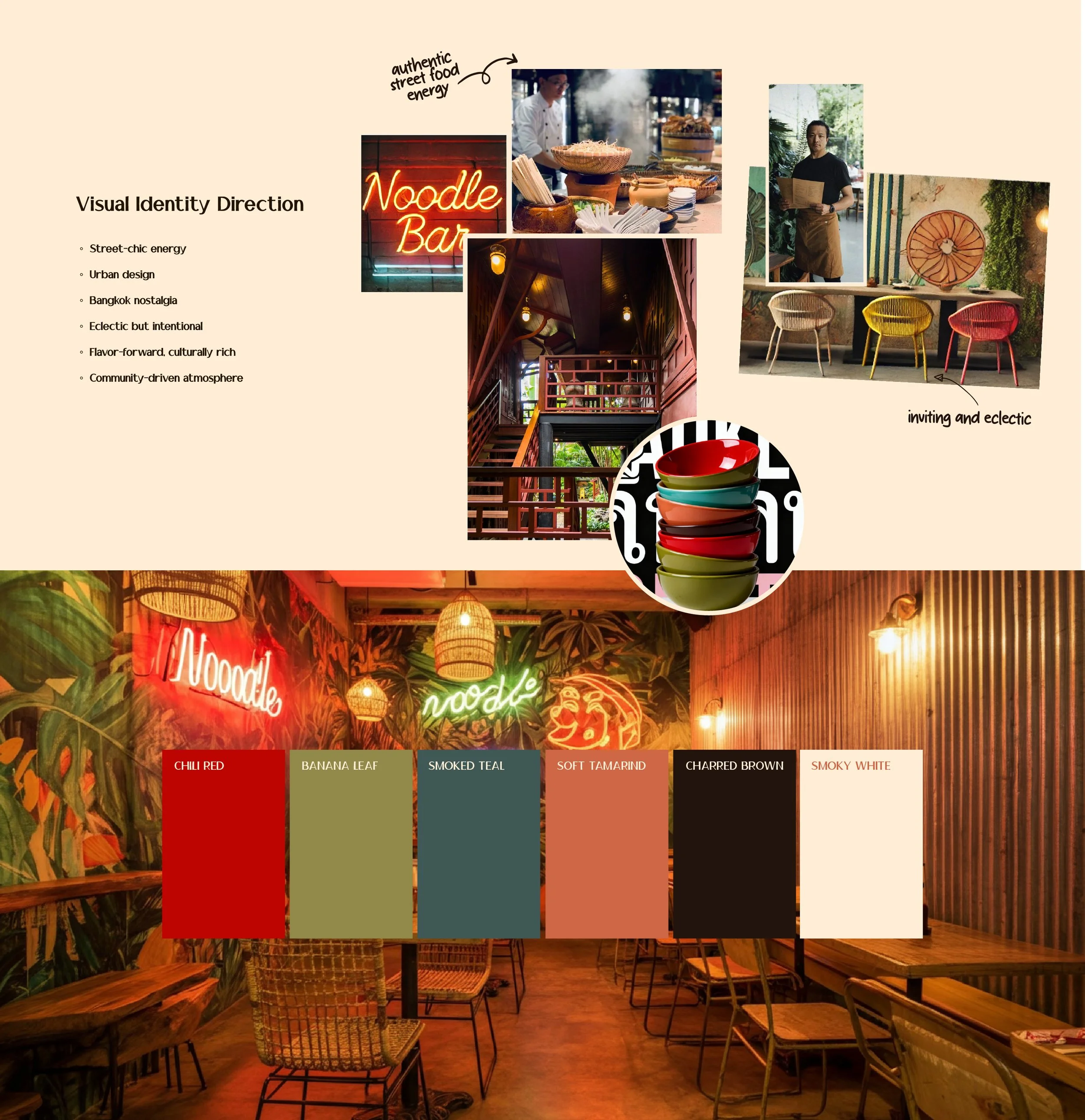
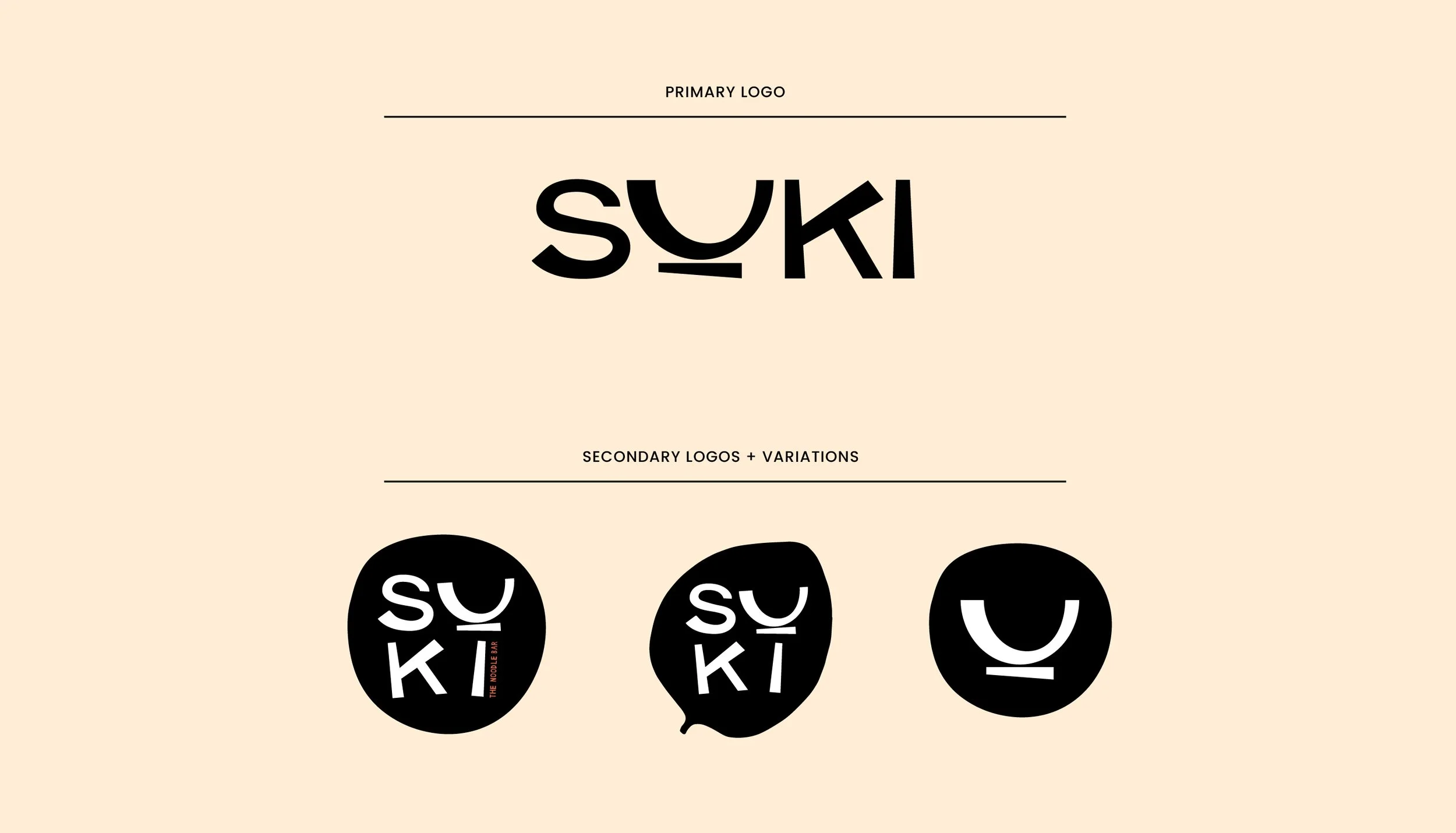
VISUAL IDENTITY:
The design direction leans towards hand-made, textured, and type-driven. I explored graffiti style expressive logotypes, and punchy colour vibes. The aim: street-market chaos but with a refined, modern twist.
COLOUR PALETTE:
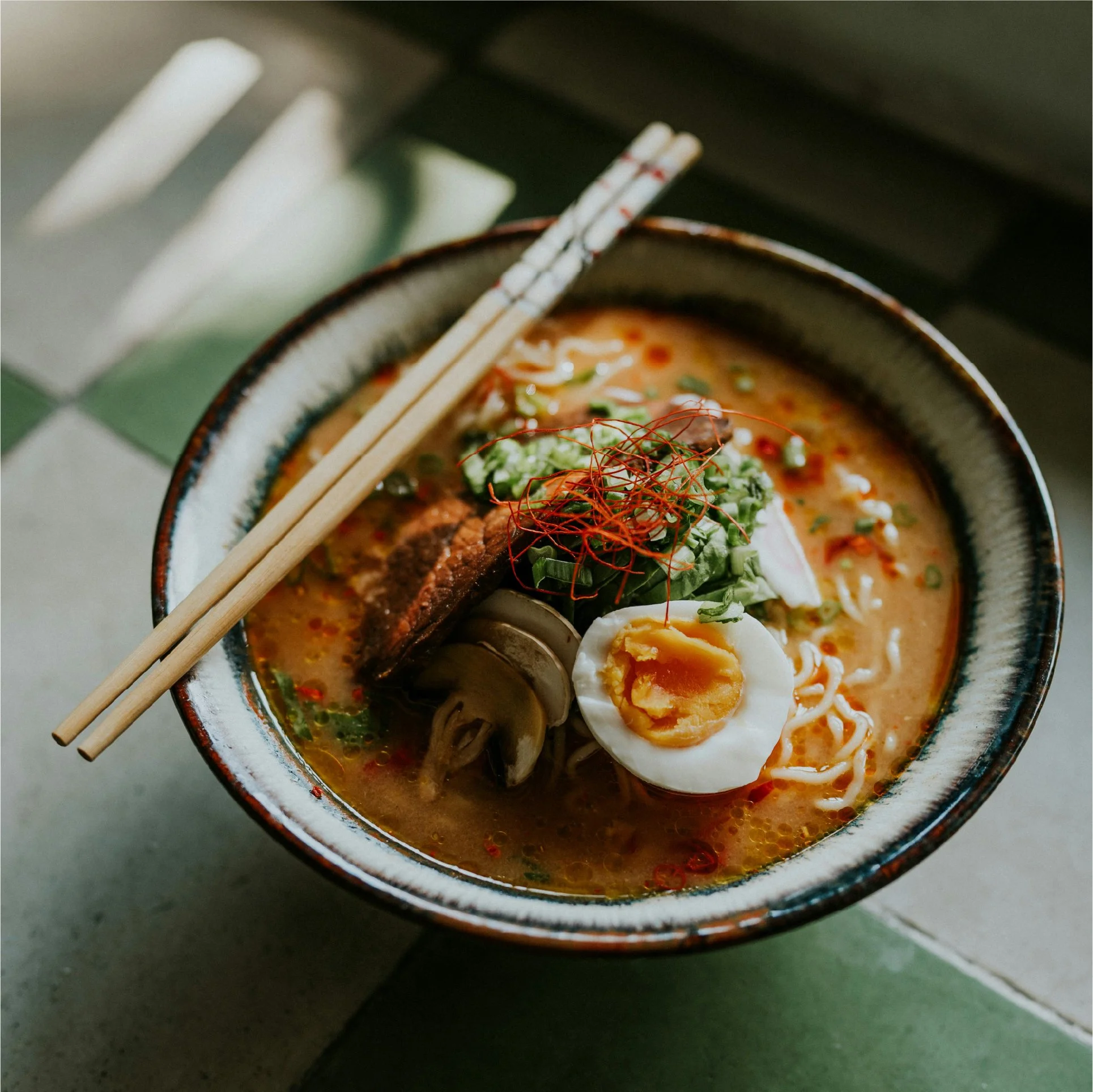
The palette is all about warmth and spice. The tones evoke the visual noise of a Thai street vendor staying close to the richness of Bangkok.
INTERIOR INSPIRATION:
Inspired by eclectic eateries across Southeast Asia, the interiors are built around communal energy. Neon signage. Hanging woks. Mismatched chairs. Rattan light fixtures. A space that celebrates culture and food.
OUTCOME
SUKI's concept identity is on the cusp of playful with an attitude, bold but not loud. The result is a noodle bar spot that instantly reads as vibrant and flavorful, even before the food arrives.
What follows is a showcase of the visual identity.
From logos to chef imagery, brand voice snippets, colour palette and mockups for the SUKI space itself. Each detail reflects the brand's balance of curated chaos and warm, streetwise design.
Welcome to noodle culture, reimagined!